Interconnect Component Library
The foundations and building blocks of Telnyx's products.
About Telnyx
Telnyx is a wireless and video-focused communications API that developers use to integrate communication solutions with their applications.
Telnyx's Mission Control is an enterprise customer portal used for setup, account management, product and resource configuration, and debugging.
Context
I joined the company in 2019. The core team decided to migrate the Portal front-end from Angular to React. Upon joining, I discovered that while there was purportedly a design system in place, upon closer examination of the design files and codebase, it became evident that it was more of a style guide and a React component library that did not seem to scale or be adopted across the platform.
Some of the identified issues were:
- Absence of a component library.
- Mismatch between the style guide and production implementation.
- Lack of a single source of truth.
- Custom components and styling.
- Lack of common patterns.
- Poor accessibility.
- Challenging designer-developer handoff.
My role
I was a solo designer leading efforts on the design side and supporting the front-end development team.
Problem
The process from ideation to production was slow and painful.
Challenge
Make communication easier between designers and developers.
Solution
While we lacked resources to build a fully-fledged design system, we decided to iterate over existing elements and focus more on shared language and less on processes and tools.
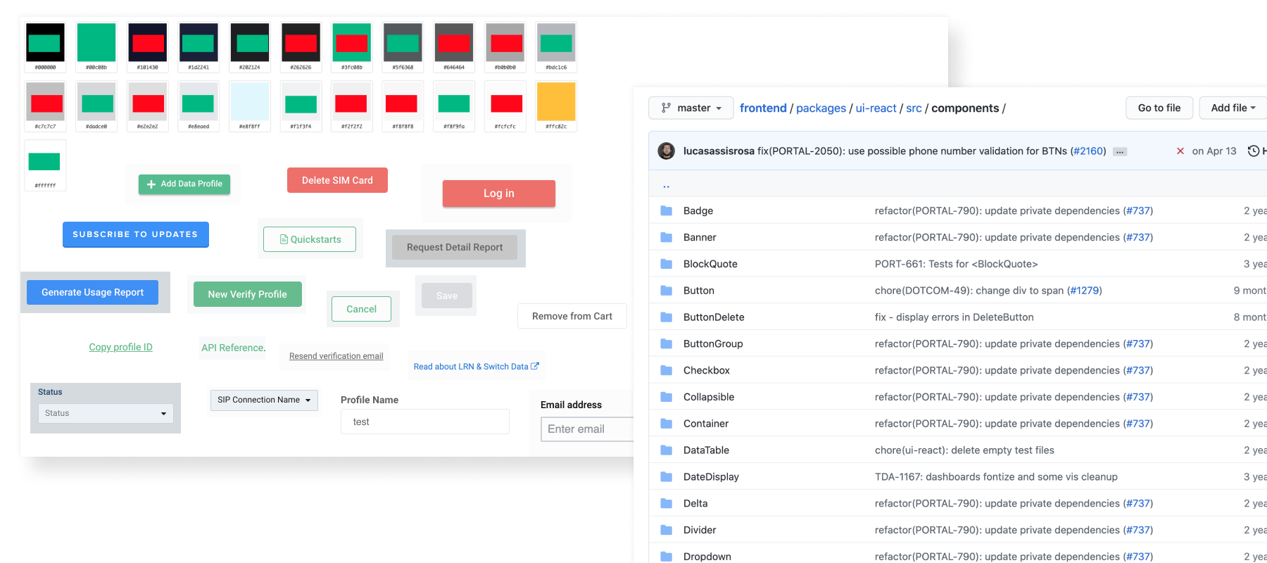
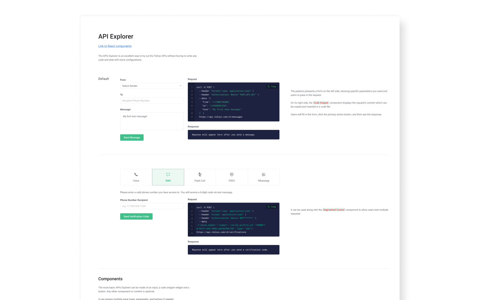
Interface inventory
After auditing our portal application, I found numerous inconsistencies in styles, particularly in colors and typographic hierarchy. Additionally, there were many accessibility issues and custom/recycled components that were meant to have the same appearance and behavior but did not.
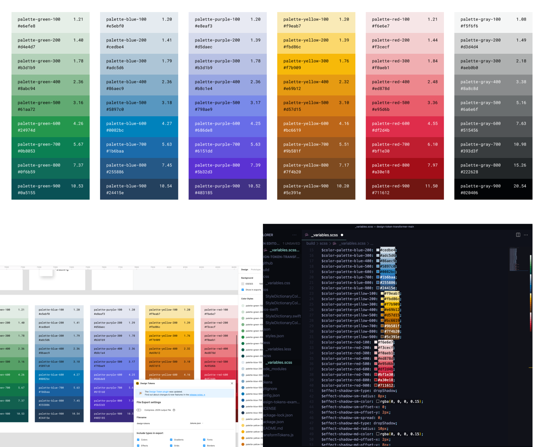
Color palette and mapping
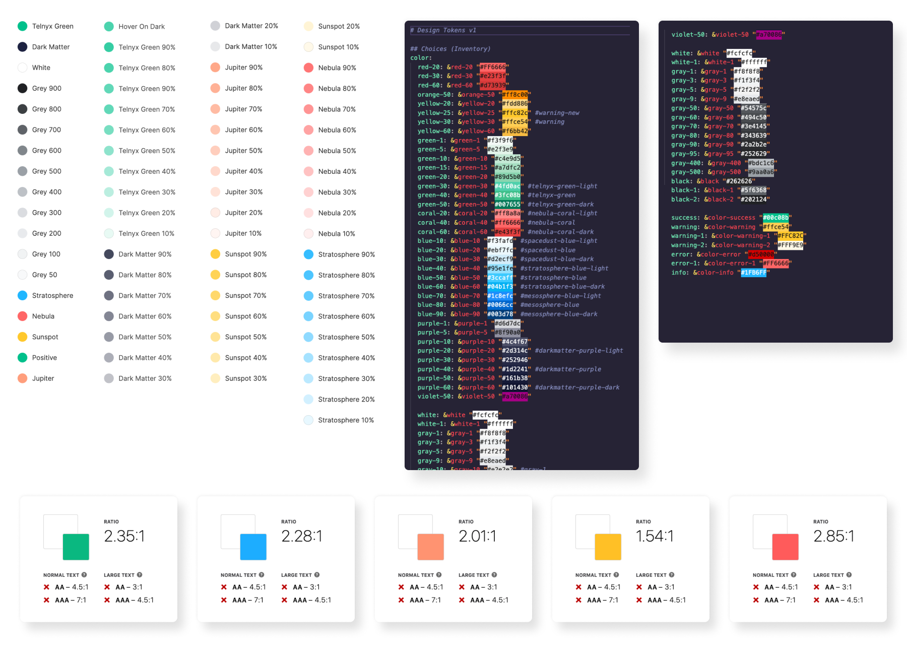
Based on existing colors and brand guidelines, I reduced the number of shades and simplified the palette. Additionally, I adjusted some colors to meet accessibility standards (WCAG 2.1 level AA).
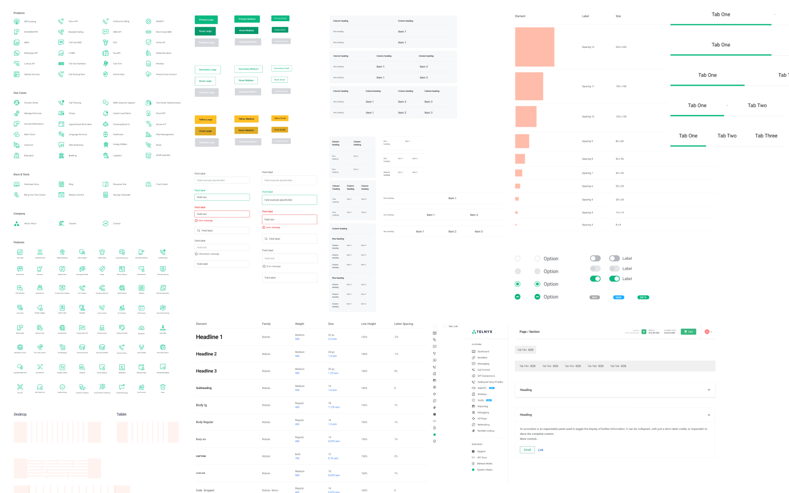
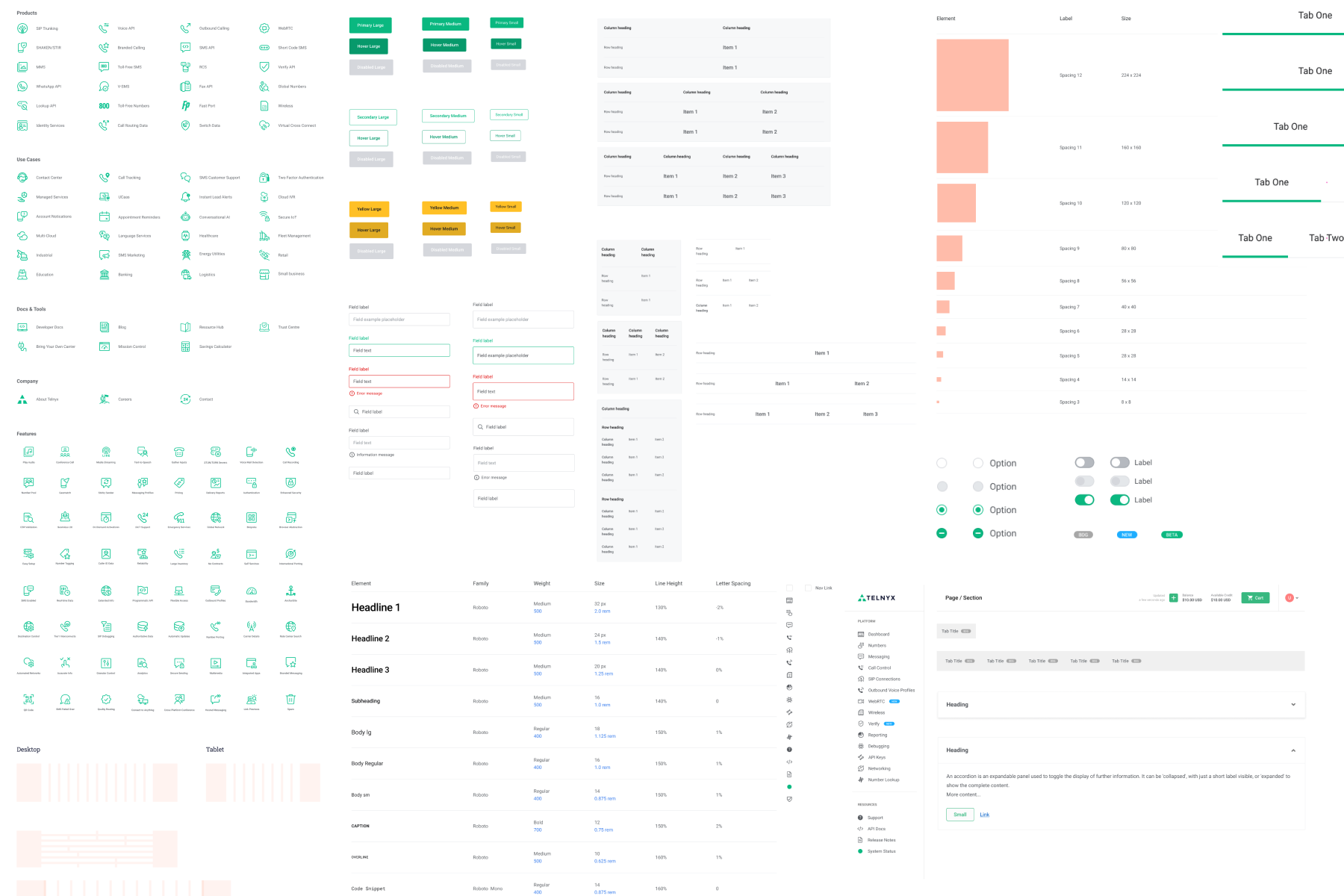
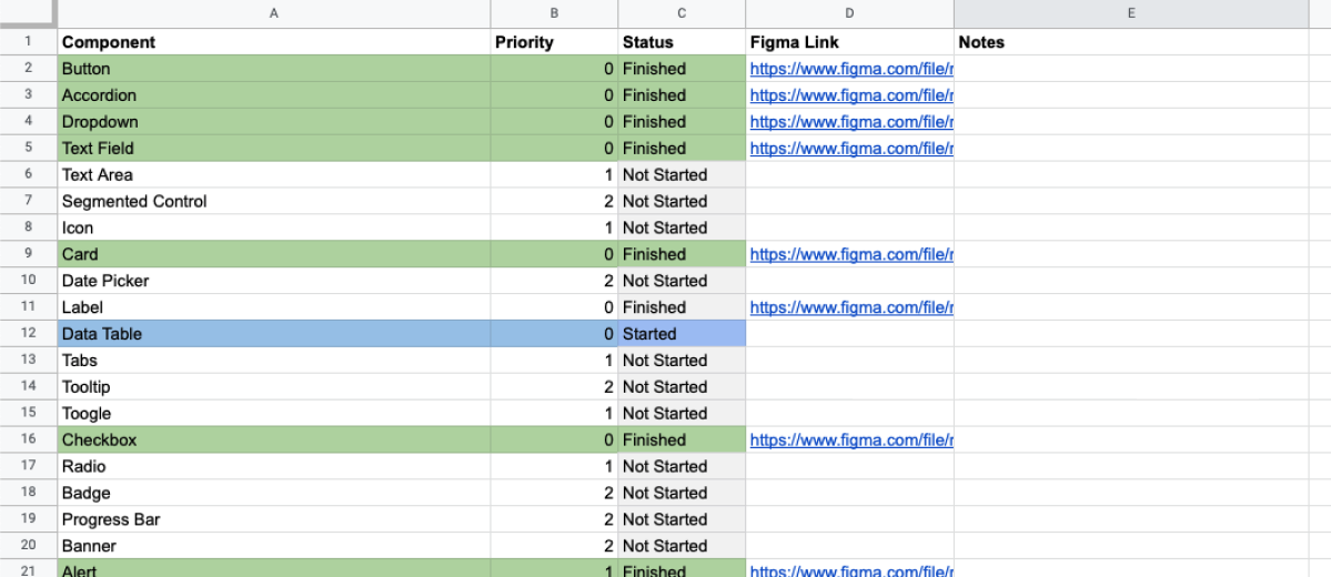
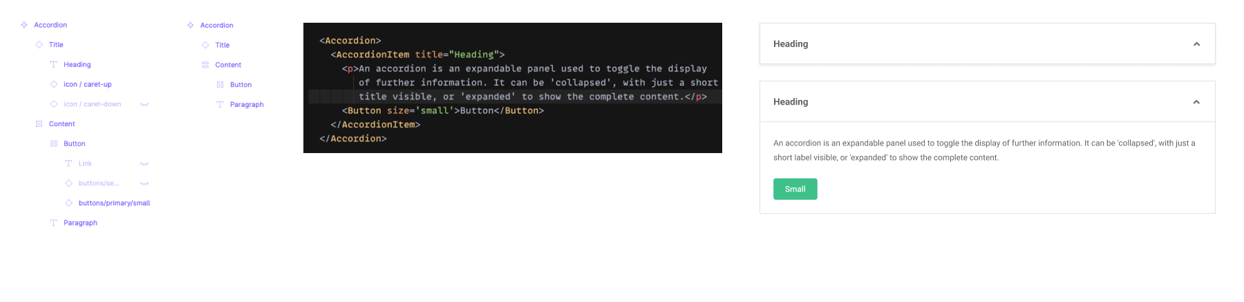
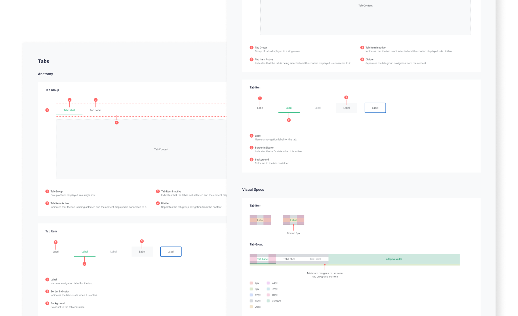
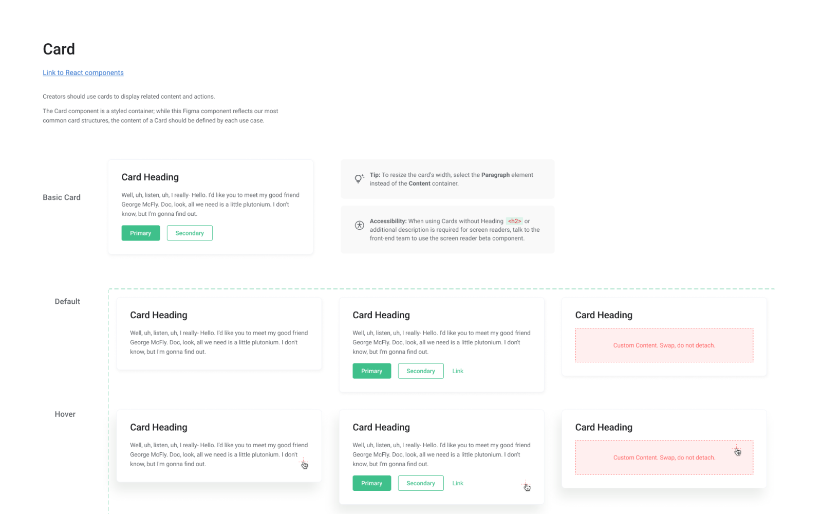
Components
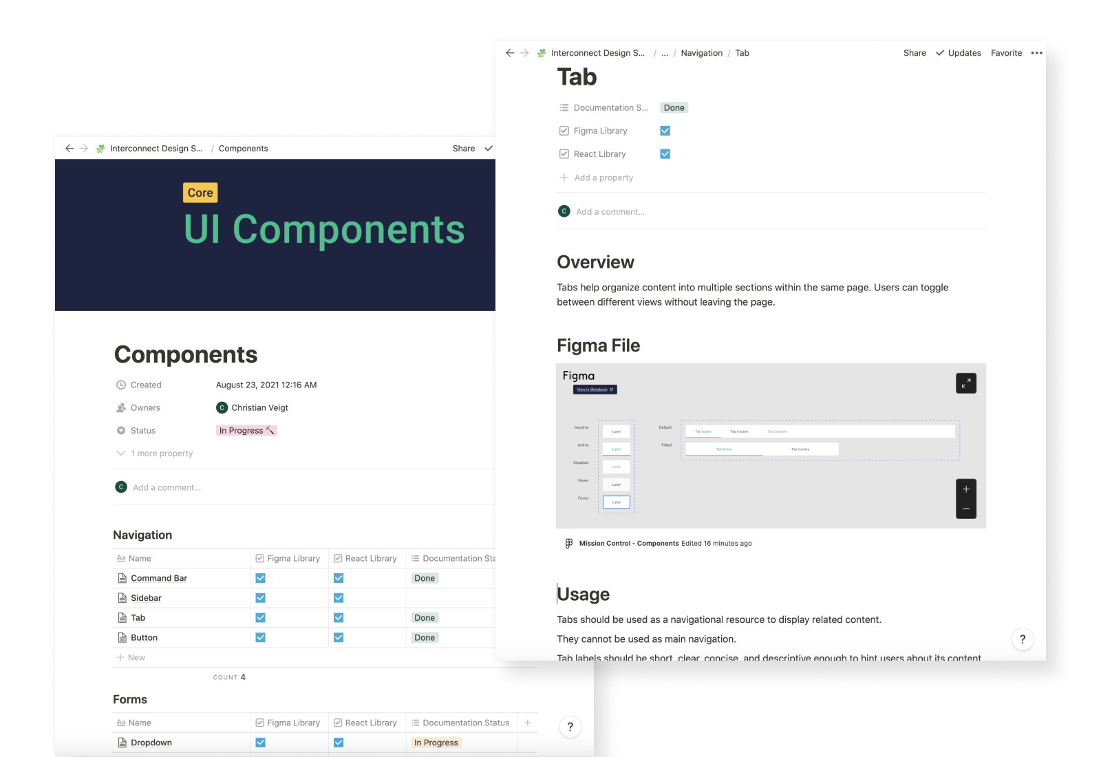
Since I was the sole designer working concurrently with other initiatives, the strategy for building or fixing components was to address them as needed for new projects. The scope was to fix or create the React component, its Figma counterpart, and add basic documentation.
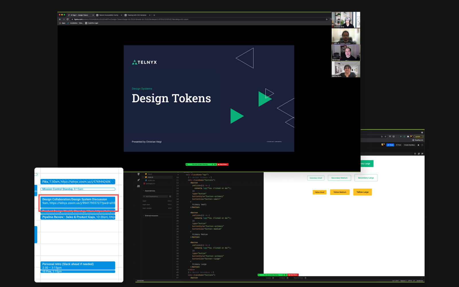
Handoff
With limited development resources, I collaborated with various front-end developers depending on the project we were implementing at a given time. Consequently, the handoff process varied, as some engineers were less detail-oriented and some were more familiar with Figma than others.
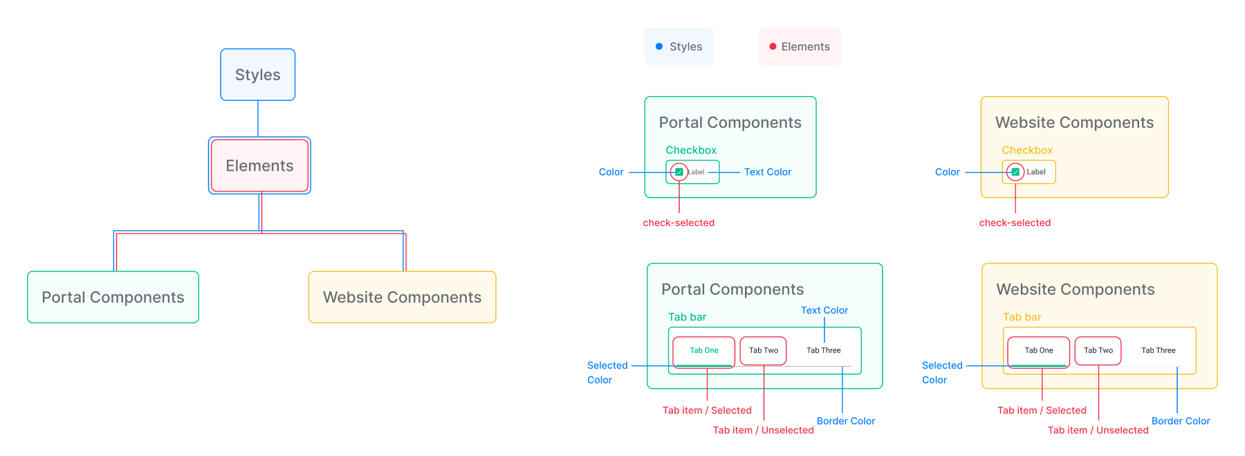
Architecture
Until that point, styles and components for the product and website were separate in Figma but shared in the front-end. I decided to align the Figma library structure with this and reduce maintenance overhead.
Documentation
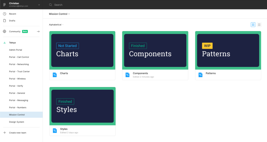
Since there were no plans to open-source or release this as a public-facing system and lacked resources for a dedicated documentation site, I set up a Notion space in a couple of days. This served as a place to document components, styles, and design decisions.
Advocacy and education
In addition to technical work, I shared concepts and best practices with designers and engineers less familiar with design systems, aiming to not only educate but also encourage usage and collaboration.
Results
Although we lacked a proper tool to measure results and impact, we used Jira metrics and anecdotal evidence from consumers for insights on improvements.
- ~ 15% Improve in implementation time.
- Significant improvement in task completion rate.
- More efficient design <> developer collaboration and handoff.
- Evident consistency in the product's UI.
Learnings
Small changes can make a big impact
Establishing a shared language and a simple, well-architected component library improved communication between teams and increased efficiency.
Share the problem
Sharing problems and pains with developers fostered trust, empathy, and partnership beyond designers. One of the main reasons I attribute the success of this project is the help I got from engineers.